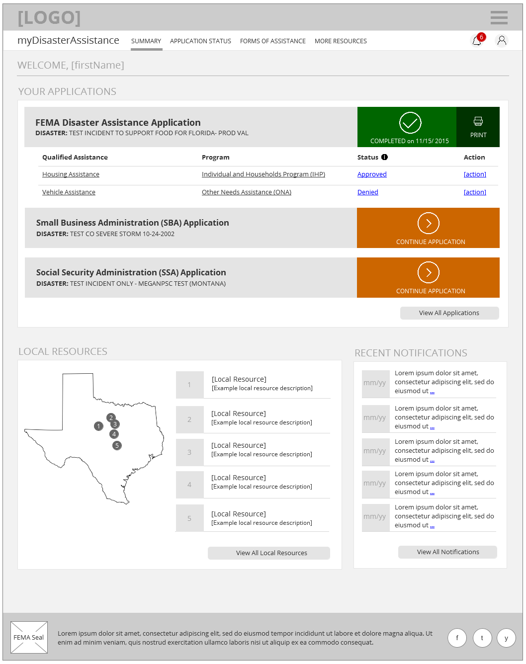
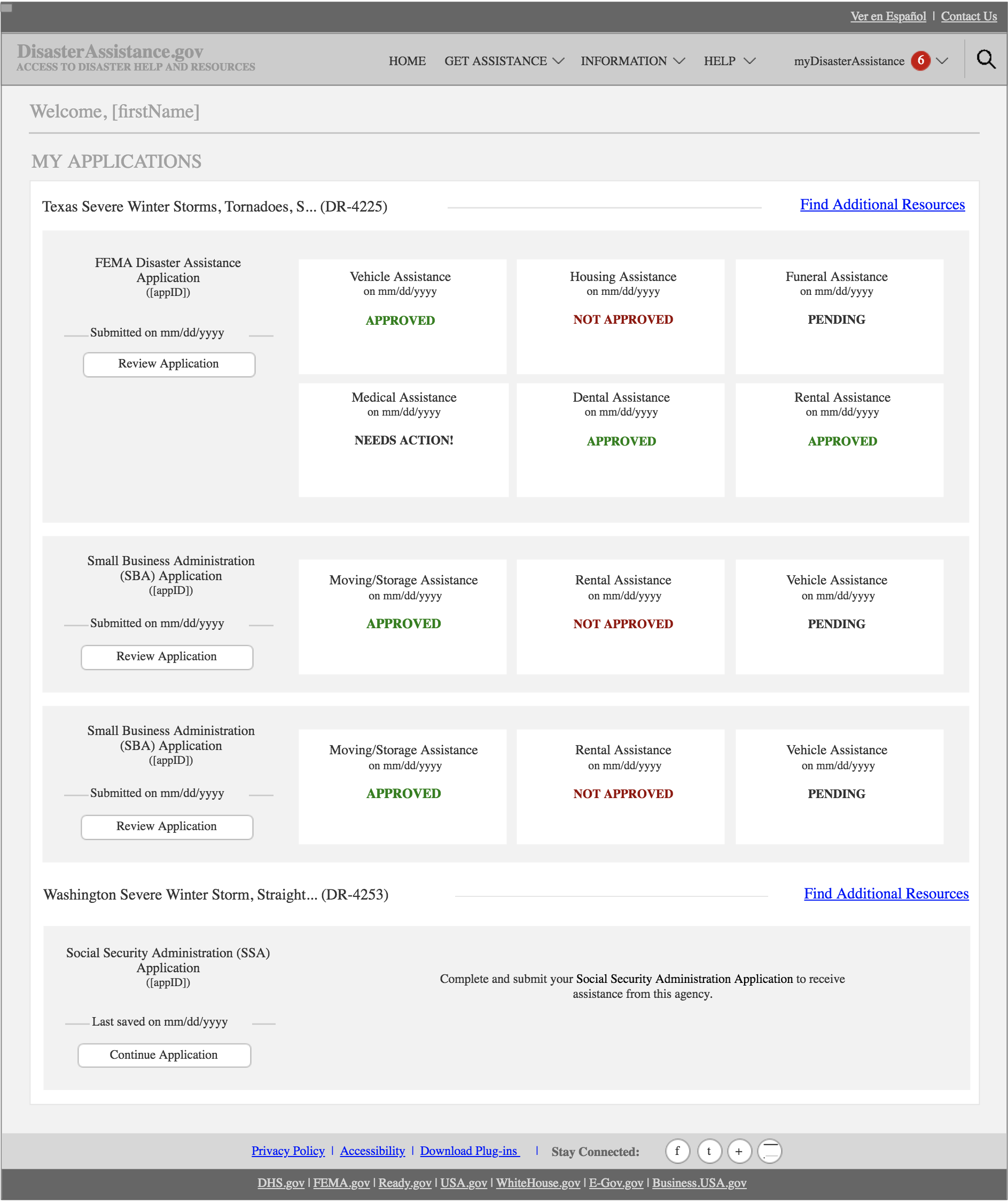
Disaster Aid is a web application which enables disaster survivors to request and monitor emergency assistance across federal, state, local, tribal, volunteer and private sector organizations.
My goal as a UX Designer on this project was to ensure that the overall experience for this website was exceptional, consistent, and valuable. In alignment with the project’s mission, I aimed to design the new website as an agency-neutral, survivor-centric portal through which disaster survivors could effortlessly request the help they need to rebuild their lives.
Fun fact: I got to share more about this project with Human Factors International shortly after I earned their Certified Usability Analyst (CUA) certification and was named CUA of the Month (July 2016). Go check it out!
The project team consisted of project management, requirements (under which user experience was housed), software development, testing, analytics, and security teams. As the Senior UX Designer and one of three DHS Section 508 Trusted Testers on this initiative, I worked very closely with each team member and made it a point to leverage their expertise where possible in terms of brainstorming and testing design concepts.
There was no defined UX strategy in place when I arrived on the scene in mid-2015. The website was already live and very much in use. Much of what I was doing early on was working to keep a good thing going. You know, keeping up appearances, facilitating design sessions, and making small tweaks to the existing interface per client request - that sort of thing.
Strategy was retroactively introduced after the fact when it was determined that user research was attainable and would be beneficial to ongoing design and development initiatives.
A former colleague of mine, Dr. Kayenda Johnson, once entitled a brown-bag presentation "Will the real user PLEASE STAND UP?" after a well-known Eminem song of a similar title. That sentiment pretty much reflected my state of mind at the time. Our stakeholders, as well-intentioned as they were and as valuable as their insight was, were not our users. The level of perspective they could provide regarding losing all of their possessions and being reliant on external resources for survival could not be sourced there; we needed to hear from those who had gone through it personally and lived to tell the tale. Once we had done so, we extracted key points and used them (1) to build empathy with product ownership and (2) to inform design decisions.
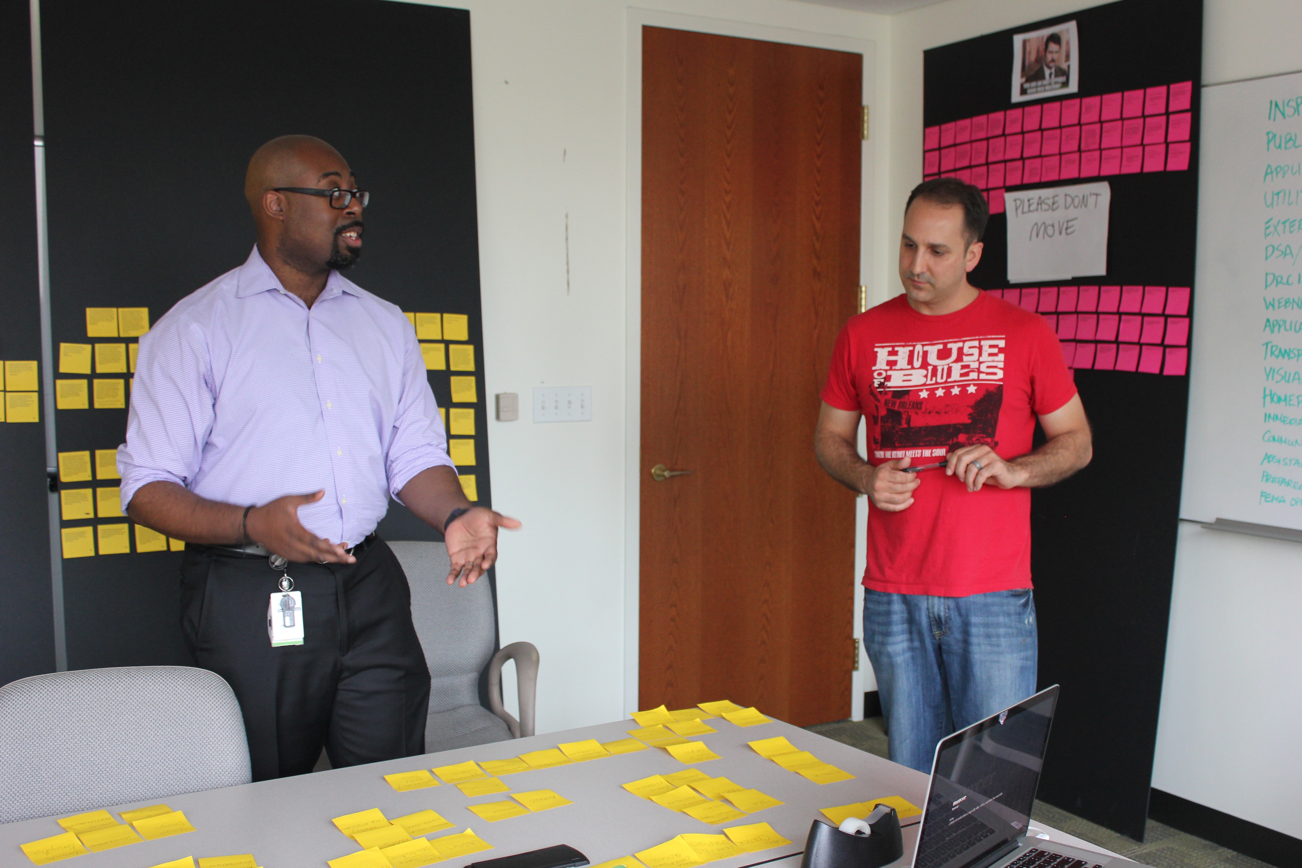
It was rough initially getting buy-in for user research. However, a pivotal moment surfaced after an all-day, in-person ideation session with most of client-side product ownership allowed them to see the benefits of deriving survivor-driven insights firsthand. They became excited to learn what other insights could be gathered through user interviews and user testing. This was the push we needed to get into the nitty gritty of research and design.
So around this time, I was pulled into another project to lead UX efforts and could only support this initiative 50%. Right when things were getting super interesting! Darn!
This was around the time the UX team was traveling to New Jersey (Hurricane Sandy) and Texas (flooding) to interview survivors, field workers, and call centers. Once they returned with a boatload of photos, quotes, and the like, we went into processing mode. I personally transcribed a number of hour-long interviews, developed several personas based on the data we received, and organized our data into visible, tangible manifestations of the survivor's plight.
This "wall of perspective" provided us with some valuable insights, such as:
Some enhancements were merely byproducts of the work I was doing on the application for assistance and survivor dashboard. The global navigation, which I personally considered to be heavier than it needed to be, was a focal point in my efforts.
Three of my biggest issues with the existing navigation (above) were:
Going back to "my issues"...here's how my design addressed those:
I could not find the 2 documents a representative told me were online.
The previous document upload did not articulate document upload types, file size, upload status, or prompts. I redesigned the feature to emphasize these aspects.
Using some of the above insights, I redesigned several key screens and user flows to better suit survivors during trying times.
I think that it would be easier for applicants to see the status on their applications and how far along the process is. I have not received any phone calls or emails about the status of my application and it's been almost a month.
This project was a case study in user advocacy. A key obstacle in this initiative was a reluctance to allow user insights to inform design. Clients believed they understood the disaster survivor experience enough to warrant the neglect of user research. Once the team was in a position to present a high volume of genuine qualitative data in a physical representation, the client was unable to challenge its validity.