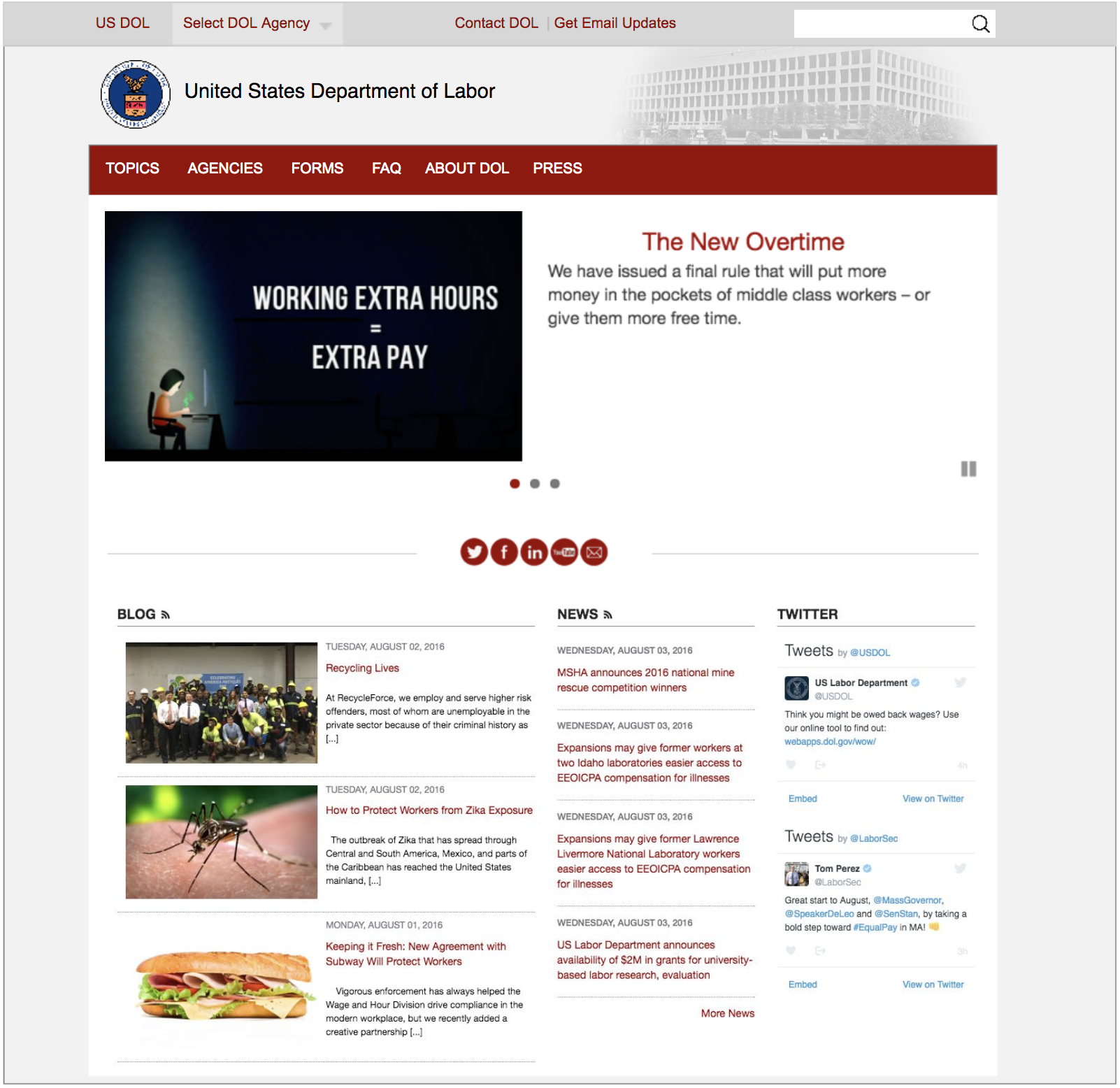
The Department of Labor (DOL) is a cabinet-level department of the U.S. federal government responsible for occupational safety, wage and hour standards, unemployment insurance benefits, reemployment services, and some economic statistics; many U.S. states also have such departments. The department is headed by the U.S. Secretary of Labor.
As an organization with diverse functions, DOL carries out its mission through a number of offices and agencies. These are organized into major program areas, and headed by an Assistant Secretary or other official.
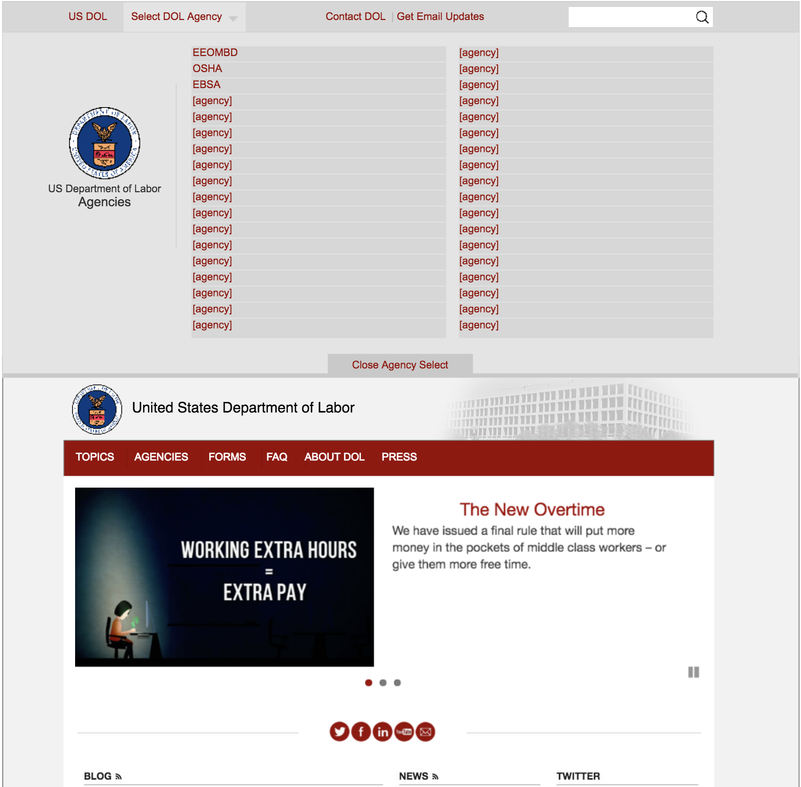
The Department of Labor is comprised of over 20 departments - each of them with their own focuses, branding, social media presences, and missions separate from the larger agency. So when the idea to establish a unified brand across the DOL was proposed, stakeholders took issue.
A solution was identified early on and, for the agencies with a more simple information architecture, this worked just fine. However, for others, this created a paradigm where roughly 4-5 levels of navigation were to be represented, pushing the site content down almost 40% down the page.
Identifying who to go to for what questions or content was difficult with so many players involved. To make matters worse, the information being fed to many of the websites was void of structure and navigation levels easily drilled down to more than five levels at points. Needless to say, it was challenging to find any information without the use of global search.
At the time I was leading UX on another related modernization initiative, my officemate - a REALLY talented designer - notified me of an issue on the higher-level Department of Labor website that could significantly impact an already messy information architecture on my project.
While I was not the UX designer on this initiative, it was close enough to my project at the time that I needed to engage and propose a solution that could potentially knock out several birds with one stone AND keep our stakeholders happy.
The initially proposed solution implemented a "global DOL header" which utilized repetitive navigation and poor use of vertical real estate to ensure the ever-presence of DOL above the agency.
This design was inspired by the lean appearance of WhiteHouse.gov's menu. However, I noted that the design wouldn't exactly map to the utility of DOL's navigation, due to the number of agencies, lack of suitable branding for such a small area, and a lack of desire for additional aesthetic to use/liven up the white space above the navigation bar.
I proposed a solution which would:
The top bar was to act as global sticky navigation that provided users easy access to the Department of Labor parent homepage and other global functionality, such as Contact/Mailing List and Search. DOL was very particular about ownership and universal branding, and other subagencies were adamant about their ability to maintain a custom identity. In this paradigm:
In the examples below, the value of allowing the additional horizontal real estate for agency names to be displayed is shown. As noted above, some of those names get REALLY long!